Website Redesign for Sno Falls Credit Union
Sno Falls Credit Union, serving over 6,000 members in Washington’s Snoqualmie Valley, needed a modern website that was visually appealing, easy to navigate, and responsive across all devices. Their existing site had outdated architecture, poor mobile usability, and an unclear design system. Our goal was to enhance the user experience while maintaining the brand’s local, community-driven feel.
Role:
Lead UX Designer/Visual Designer
Credits:
Created at Clyde Golden
Collaborators: Aimee Palacios, Brian Leahy
Creative Directors: Michael Ryan Wilson, Tim Yeaden

The Problem
To create a seamless digital experience, we focused on three major pain points: responsiveness, visual clarity, and intuitive information flow. By addressing these challenges, our goal was to build a website that would empower Sno Falls members to easily access financial services.
Not Responsive
Members struggled to access the site on mobile, limiting their ability to manage accounts on the go.
No Distinctive Visual Design
The site lacked a cohesive visual identity, making it harder for users to understand and engage with services.
Complicated Information Architecture
Scattered loan and deposit information, buried rate sheets in PDFs, and unclear CTAs made it difficult for members to find key information quickly.
Original Website


New Information Architecture
The client did the work of developing a site map which we used as a foundation for information architecture. This was a nice platform from which to build, but we needed a document to classify page levels and show how the different pieces of the site were interconnected.

Information Architecture Modifications
We added page-level classification and a color indicator to show which links clicked out to external sites
We added a “Member Center” nav item to house useful information for members like pdfs, applications, and information about security
We created more space to introduce the brand to users by creating a dedicated “Join” page
Instead of a pdf, we consolidated all rates information on the site and housed it on one page, where users could filter by categories (Loan/Deposit)
We added a “Search” function for users to quickly find information

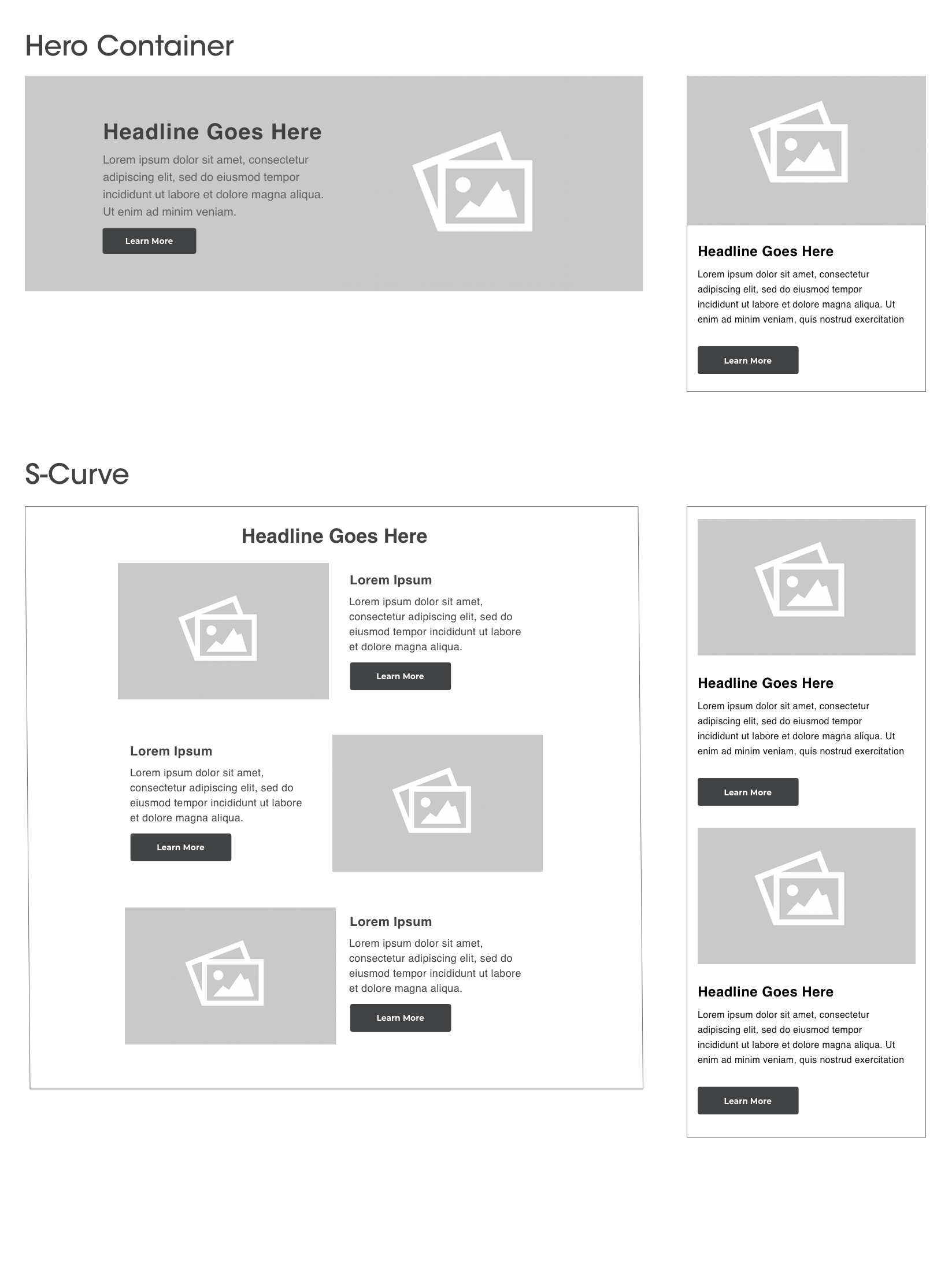
Modular Approach
The project timeline did not allow for a lengthy lofi phase so I only sketched out a few pages before transitioning to full color. The process helped me start developing visual queues which could be later used as part of design system.
The site needed to be editable by non-technical staff so I designed flexible modules that could be used flexibly in WordPress. This allowed website admins to create pages easily by assembling appropriate modules depending on page needs.


Visual Concepts
I worked with Creative Director Michael Ryan Wilson to develop two different visual directions for
the client to choose from. The client selected Concept 2, seen below.
Concept 1
This concept used lively illustrated overlays to highlight moments and milestones in our daily lives. Pictures captured how people might interact with Sno Falls and benefit from its services – online banking, car/home loans, etc.
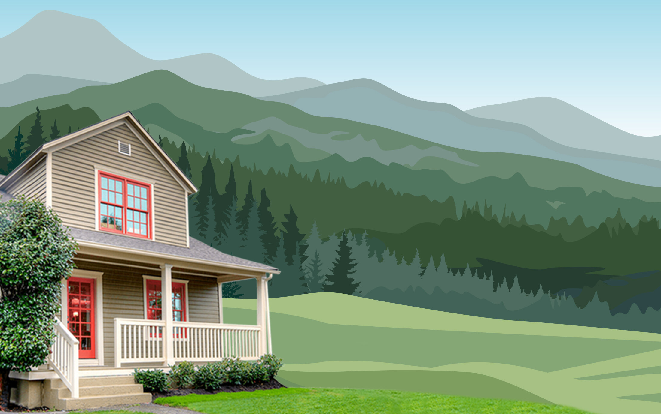
Concept 2
This concept showed simple illustrated backdrops of environments composed with real photos of products like buildings, homes, and cars that look natural together yet unexpected that a piece of that world is illustrated.


Design System

Color
Sno Falls had an established logo and color palette at the time we started our redesign. They were open to evolving their brand, but wanted to stick with the general foundational elements.
The process of expanding the color system unfolded organically. We used the same green color values throughout most of the illustrations or drew from the primary brand colors to add variety where appropriate. The idea was to convey a sense of cheerfulness to the user experience through color, while maintaining enough consistency to establish a footprint for the brand.
Type
To keep the type consistent with the bolder illustrations, we selected Gotham Screensmart paired with Montserrat. The heavier weight of Gotham Ultra felt appropriate for headlines while the highly legible, comparatively lighter feeling of Montserrat worked well for body copy and sub-headlines.

Illustration
We created illustrated backdrops that depicted features of the Snoqualmie area - trees, mountains, and a mix of both rural and neighborhood scenes.


Outcome
"Sno Falls is delighted with the new site and the personality it brings to their online presence as a local credit union. They're excited for the new site to not only be a benefit for their current members, but also use it and their new style as tools in their marketing efforts..."
-Scott Gregor, Project Manager - Clyde Golden
Upon completion, the site received an award from the American Graphic Design Association.
URL: snofalls.com


